Sunday, February 27, 2011

IAR221- Blog Post #7

Architecture of happiness in my eyes is architecture that helps guide one softly through a place where there are things like objects, lighting, etc. that the viewer prefers. If one is looking for a quiet place to relax,then a spa, coffee shop, or relaxation room would make them happy. However, if one is wanting to be outdoors to workout, or a rec center for instance, then perhaps they would not be happy, but rather miserable and upset. Therefore, architecture in terms of happiness is based off of the humans needs and wants. This is a rule when it comes to architecture and design, because without this then the purpose for making architecture would be dead. The people who are wanting a particular space needs to have that space produced to meet their needs and make them happy, but if a space is created without taking into consideration what the client wants, needs, or desires the purpose is not met.

For my happy place found on campus, I chose Starbucks. Starbucks is a happy environment where I can relax because it is where I go to escape from homework, to get warm when I am cold, and relax and catch up with friends. This place, not only has the wonderful aroma of coffee, but warm lighting, and relaxing music. Their sofas and booths make it comfortable to sit in as well. I feel that the designers and architects that designed Starbucks took this "happiness" factor into consideration and the outcome was well achieved.


For my happy space, I chose the interactive screen place in the EUC near the multicultural center. This interactive space is one where children, college students, even older adults can take a break from their busy lives and schedules and play and "act young again". It also allows people to enjoy and be happy about technology. Sometimes people can get frustrated with the advancement of technology and this space allows them to "reenjoy" it again. Not only does this place help one do this, but to feel a sort of accomplishment and competitiveness as well. This is by collecting the pebbles that drop. Perhaps competing with yourself  to catch more each time, or against a friend or accompaning partner. These reasons are why I chose this space. I believe the designer who had this in mind for our campus achieved making this a happy place and somewhere where a college student can act like a kid again.


IAR221-Reading Response #7- Symbolical Shrine


IAR221- Reading Response #7 - The Symbolical Shrine

For this week's reading response, I chose to do a powerpoint presentation. Below are the slides.


Thursday, February 24, 2011

Theory Reading #3 Social Ecology

In reading this weeks theory reading, Social Ecology, I was able to gain a better understanding and knowledge of the way people interact socially based off of their relationships with the people around them.

Group is defined as any number of entities considered as a unit. Social is defined as living together or enjoying life in communities or organized groups. Therefore a social group would be a number of entities considered as a unit that are enjoying life in communities.

In seeing these definitions we know that a group consists of more than one individual and these interaction of being social is by having these groups of people.


In relating the information in this reading and these definitions to my dining project and the space I have designed this is what I think relates the most:

In first looking at relations to my dining space, one of the most important things is life space. Life space are all forces that affect the individual at a given moment. So, the space of dining will affect the individual. How does one make that affect positive and meaningful? Taking into consideration of the space as a whole will affect the way the individual interact with one another as well as how they feel about each other. But, before looking on how the individuals interact, we find that about 71% of all groups, both informal and work groups contain only two individuals. Through this we learn that most groups are only two people, but when people dine, they often dine in groups. Groups of eight to ten hardly have one complete conversation like two individuals unless a structural activity is involved. So when dining, we have to consider that there may be just one conversation, multiple, or both. The way people sit affects this, and tells one how their relationship is. So, we as designers need to know when designing a space, how well the people inside it will know one another. Based off that knowledge, a designer will place chairs certain distances and directions from each other, as well as the shapes of the tables if included. Through knowledge of peoples relationships, the reasons for the room, and the definitions of group and social, we can create any space (even dining) more informed and suited for the ones using it.

Working Model for Dining Space project

Here is the model created to help represent the current dining room I am designing. The space is in the shape of an octagon, but with its own twist. The emphasis of axis is used greatly in my design, focusing on the intersection of this importnat part. Windows help bring in lighting and a fireplace is added to emphasize the axis and represent the sunset that takes place behind it, bringing the orange tints and shades into the room giving warmth. The table is surrounded by chairs on three sides, leaving one open for the connecting of the other countries family table through the projection screen. For seating, a Eames swivel chair will be used.

looking towards the west at the direction of the sun.

looking down as if it were in plan

view through eastern window

model  
I am currently working on adding a stepping of windows on the back wall to help bring more circulation and roundness to the room and emphasize the entrance and exit. I will then be working on making a ceiling for the model which will show the oval indention above the table.

Dining Space Parti- the picking of material and texture

Picture of Parti board
 
The pictures on the board reflect what I will create above my table falling from the ceilings oval indention. This texture and method of creating shadow and lighting with crystals will emphasize my table, which is the focal point of the room. The flooring will be dark in order for the viewer to focus solely on what is the room and the things inside the room. Textiles will fill the room to add comfort and texture from smooth to rough. This use of texture will help add emphasis to the most important parts of the room. 
In looking at colors, the use of a green granite material will be incorporated into the sideboard and table and different shades of red will be added around the room. However, any color in the room will be able to be changed into other colors based off of what they mean for the two countries and finding which color fits the two most perfect. Therefore, keeping the main parts of the room neutral is necessary.

Material Study

For the material study assignment, I had to select 4 different materials: carpet, granite, textile, and wood/bamboo.  Below are the material studies I have done in creating these materials with pencil and pen in a material value study. I looked at the material in the lightest and darkest situations and reflect how they will appear in the study. 


Making Technology through Social Media Advancement

GLOBAL WORLD TRANSLATOR
Communicate with others in business, or everyday phone conversation from around the world with this device. Language barriers will no longer exist because the device will automatically transform ones language into your own with the voice that sounds like theirs and not a computers. Become more social with people throughout the world without letting things like language get in the way.


Parti Board of idea and invention

Drawing of the GWT device

picture of actual scale model. the mirrored section represents the GWT screen. The semi circle top is the turn off and on button which matches the US flag representing that someone from the US is using this advice. a plexiglass/ glass runs around the perimeter of the device giving it a frame.

Sunday, February 20, 2011

IAR221- BLOG POST #6

The two cathedrals discussed in class on Friday in the lynx group were Cologne, Germany and Salisbury, England. In discussing the contrast and comparison between the two in terms of construction and light, many interpretations were given. It was perhaps through this discussion that we are able to relate these cathedrals to region and a map to the medieval times and tell why these cathedrals are so important.

Comparisons between Cologne and Salisbury in terms of construction:

Both cathedrals have vaulted ceilings and arches. These help represent the scale, importance, and musical tones of the structure. Columns are placed reaching vertically to not only reach to the heavens, but to direct people there to have communication to the trinity. Vertically reaching columns of windows help make this reaching upward become more achievable and real.

Comparison between Cologne and Salisbury in terms of light:

The lighting in both cathedrals help give light to the people in a time of darkness. This is contrary to the time period they live in (dark ages) and gives them hope that the future will be bright. The glowing makes this feeling of going upward a kind of reality, making it lifelike and making one feel as if they are in heaven for just a minute. Perhaps, most importantly this light is what helps direct one to the alter and direct people through the space. This light coming to the alter could stand to represent the importance of the priest to the structure in that it is through him that we can communicate to the on of higher power, the almighty, the one and only God. Lastly, a unique discovery is that the location where this light comes in is in groups of three, three windows (the father, the son, the holy ghost).

Below are pictures of each cathedral and some of the contrasts the two have:


Cologne, Germany
http://www.worldculturepictorial.com/blog/content/worlds-tallest-buildings-part-i-cheops-pyramid-lincoln-cathedral-st-olav-strasbourg-cathedral


This cathedral has two columns at the entrance. These columns lead people to the cathedral as well as guide them in. The center column lies on the axis showing the connection to the heavens and the rising upward to the light.


http://www.traveljournals.net/pictures/198316.html

The windows show glowing up towards the ceiling, helping the viewer look upward and face the heavens. Perhaps this helps them look to the brightness the earth still has during the dark ages.  (notice that these windows come in a bundle and not in groups of three.
http://www.travellerspoint.com/photos/stream/photoID/148809/orderByID/

This picture shows the two columns at the front of the building which helps guide people in.


Salisbury, England:

http://www.igougo.com/journal-j8480-England-Salisbury_Sarum_and_Stonehenge.html


http://www.mrtattieheid.com/Mr%20Tattie%20Heid/SP2BoL%202007%20Pt%201.htm
The first picture shows that this cathedral has multiple columns marking the corners of the cathedral. The biggest of the columns is marking the axis (the most important spot of the cathedral), the center of the cathedral. At the top of the cathedral the two small columns marking the end of one section meets with the roof of the cathedral easily making the number three. The use of three is also evident in the windows of the cathedral.

The second picture shows this representation of three (the trinity: the father, son, and holy ghost) in the windows in the interior. In contrast to the cologne cathedral, this cathedrals windows are lower making the viewer not look up as much. This light puts a glow on the alter and the windows stone features.


These contrast show how region effects how something is built. Though these two cathedrals try and are intended to achieve the same purpose, but do not exactly do that to full extent. Though they both help one see brightness in a time of darkness and reach upward, they do it in different ways. They both however direct one upward to the heavens, making them important locations on the map both regionally and globally, because it is not all buildings or locations that have such extraordinary connections.

Here is my cognitive map of the Cologne, Germany cathedral to the region and the world in which it stands:


IAR221- Reading Response #6- The Great Helicoidal


THE GREAT HELICOIDAL

For this reading response, I decided to create a double sided board that focused on the Great Mosque at Samarra, especially the minaret at this place. The wondrous structure itself has not only taught me about architecture in the 800 CE, but has also helped me link our first unit on FOUNDATIONS to the unit of REVERBERATIONS. I hope that through my information and pictures provided on this board, you will gain the knowledge and understanding that I have through this structure. It is a wonderful asset to our world, our planet, and to the brains that hold our knowledge.


Front of Board- The stacking of information of the Great Mosque at Samarra

Topics from bottom of minaret to top:
1. Silence
2. The Silence is Broken and we find out....
3. 2 Mosques
4. The Great Mosque
5. Minerat

back of board - Descriptions of how this effects us today and how this structure connects foundations to reverberations


Sources: Ching and military information website (included on board)

Tuesday, February 15, 2011

IAR221- Unit Summary #1 FOUNDATIONS

Back in 3500 BCE the foundations of architecture began. It was humanity’s realization that objects, spaces, buildings, and places have important meaning and use for everyday life and communication in a verbal and nonverbal way(culturally and subculturally) that they began to put emphasis on the spots that meant most to them. It’s where these important spots were that the use of circles, groves, and stacks, became incorporated into architecture, bringing great meaning and purpose to these structures. It’s what they used to help emulate the world and its features. One of the oldest and most worthy examples of this is Stonehenge, the circular stone sacred spot, which mark a location and emulates the sun and moon. The pyramids at Giza are another location worthy of mentioning when looking at emphasis on a structure using stacks. The pyramids stacking symbolize mountains, hierarchy, importance, and the separation of categories. It also points upward facing the heavens. These three shapes lead to contrast, emphasis, unity, harmony, balance and proportion in architecture. Since these shapes now achieve their goal in marking spots and giving meaning, they then become used as a way to guide humanity about in a specific order.


 Stonehenge - http://crystalhatchlings.com/EasterEggs/Stonehenge.htm


 Pyramids at Giza - http://www.globetourguide.com/2009/04/pyramids-of-giza-of-egypt.html


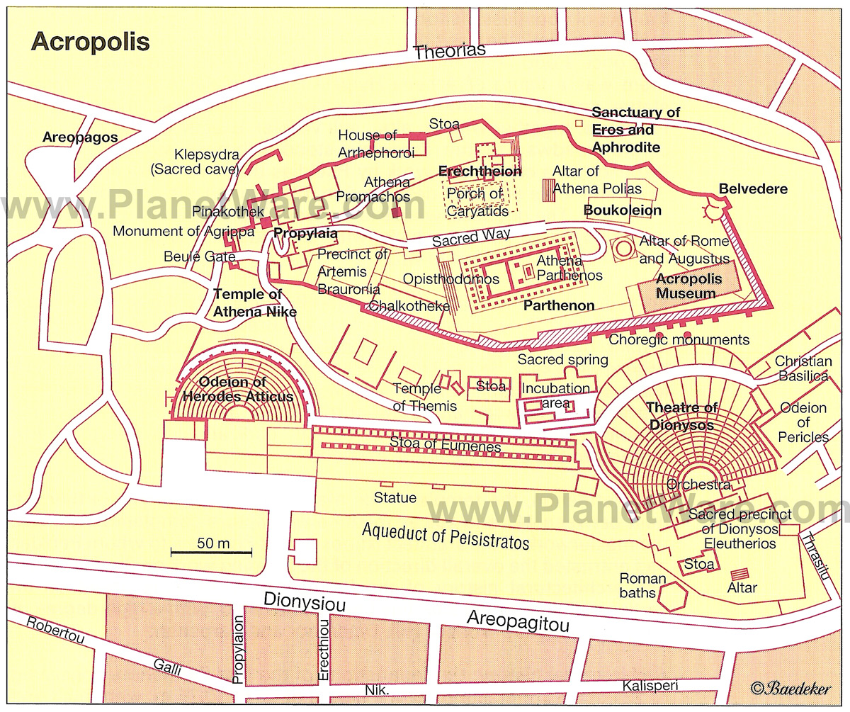
Arrangement, type, and style are all useful words when describing order in architecture. What is the arrangement of the buildings? The type of materials used? And the style added to make it unique and purposeful? The Acropolis in Athens represents order in the most perfect representation. To guide the viewer, through the three main parts of the Acropolis, the porch, court (Erectheion), and hearth (Parthenon) the use of groups and stacks were used. As the viewer, we are guided from the porch to the erecthion where the ionic and female sculpture columns direct us towards the angle view of the Parthenon (the hearth) and “momma” of the spot. The scale, columns and stacking give this main structure its attention and contrast to the buildings surrounding it. Perhaps the five orders of architecture help this. These five orders are: Tuscan, Doric, ionic, Corinthian, and composite; the first being a prototype and the last a hybrid. The proportioning of buildings at the acropolis helps one start to incorporate the space as a whole, see power of the figure(s) or meaning represented, experience, principles, precedent, size, order, scale, technology of the time, and surface attention and detail within architecture. Though the Acropolis is a good example of the use of order, the ways in which people order varies based on the given culture and society in which they exist. The Xianyang palace and terracotta warriors are a perfect contrast and comparison in looking at order to the Acropolis. The Xianyang is concealed, focused on emperor and representing politics and brokenness (in a valley), while the Acropolis shows praise, strength, power, and flow (on top of a hill). Both use the same forms of order and emphasis on the ten elements to make their location one of a kind.

The order of the Acropolis - http://www.planetware.com/map/athens-acropolis-map-gr-acro.htm


Order and the ten elements lead to architecture and structures stability, surface, and form through commodity, firmness, and delight. Is the use of circles, groves and stacks properly placed, and do they have meaning? Does it create a sense of space and a positive effect? This leads directly into everyday places and how they hold to the earlier foundations that architecture is built upon. Do ones baths, markets, colosseums, and basilicas stand strong with the foundations? In fact, some do even in combining past foundations together like a circle getting a square. Foundations of architecture are never ending; it’s continually represented in buildings and structures today.

The Colosseum - http://www.colosseum.net/listingview.php?listingID=1

The plan of St. Peter's Basilica - http://www.newliturgicalmovement.org/2010/07/architect-dino-marcantonio-on-christian.html


Modern use of architectural foundations in the music building at UNCG - http://www.flickr.com/photos/digitalprojects/


Notes and reflection of Unit 1 of IAR221


Foundations within architecture
When did architecture begin? Is it still evolving? And, if so is it similar to the ways in which it evolved in the beginning? How are things expressed through architecture and what does it do for us?
All of these questions are answered in the first unit of History and Theory of Design 1. Here are our focal points and a summary of what we learned in each:
[looking in + outward, humans materially encounter the cosmos + construct inhabitable signs + symbols as objects, spaces, buildings, and places]
All the way back in the 3500 BCE we begin to take a look into the starting fazes of architecture, but it wasn’t until 2500 BCE that a more in depth beginning  and understanding was found. This foundation in understanding was found in Stonehenge and the pyramids at Giza. In looking both culturally (the true meaning of the object, space, building, place) and sub culturally (the hidden meanings through alternative expression) we are able to begin to attach architecture to purpose and the causes of why things were built the way they were. Stonehenge was built using stones in the shape of a circle to emphasize the importance of the moon and sun and that the location was a sacred spot.
[circles, groves, + stacks stand as humanity’s first elements + principles of design throughout a world populated by diverse human expression]
In looking at architecture and humanity’s first elements and principles of design we see a commonality within them in the use of circles, groves, and stacks.  Circles help one reach the heavens. It’s a sacred spot where importance is often laid. And lastly, it helps emulate the sun and moon. Stonehenge is a perfect example where the use of stones placed into a circle represents all three meanings. Groves or rather a repetition of a vertical object helps mark a location as sacred and special (the temples and the Parthenon). The grove form looks human like as well giving a connection and relationship to the two. Stacks represent mountains, the levels of hierarchy and importance; it places each one into its own category (Pyramids at Giza, Erik and Uridu).  We can see evidence of this approach in design here on the UNCG campus and practically everywhere one goes. Below are a few examples of these three concept in today’s world.
[the buildings atop the Athens acropolis serve as archetypes for all western architecture + design; elsewhere, humans expand groves +  stacks]
In looking at the Acropolis’ five orders and the system of proportion, we are able to extend our understanding of the uses of circles, groves and stacks. These three elements help one figure out the directionality and flow of a given space. For the acropolis, the viewer is directed

Value Study

For this project, I was able to further my practice in value study as well as visually see how important value plays in giving something texture and shade. I appreciate this assignment because it also taught me that gray is in fact a color and that there is more than just one shade/tint of gray! There is even french grays, cool grays, and multiple other kinds!

Sunday, February 13, 2011

IAR221- Reading Response #5 St. Peter's Basilica- Rome

For reading response four, I chose to emphasize the importance of St. Peter's Basilica in Rome. In looking at its form, shape, and size one is able to gain a better understanding in why basilicas, cathedrals, and churches are designed in the ways they are today and throughout history. This building is truly remarkable.

I represent this response in the form of a two dimensional poster in the shape of the structure. The important parts of the building are emphasized with orange poster and pictures show what you would see inside.


Sources: Ching, Roth
picture sources are located on poster under pictures

Saturday, February 12, 2011

IAR221- Blog Post #5- Connecting design with music through poetry

Structure in Kansas City, MO


The repitition of its material and form
reflects the many times of its being reborn

Each and every grey tone
making the form look like one big bone

The harmony and rhythm in each layer
adds to its scale making it not so bare

From pianissimo to fortae
it surely rises up high above the bay

... each and everyday.

Tuesday, February 8, 2011

Theory Reading #2 Design and Culture


In watching the film, Babette's Feast, I was able to not only gain an understanding of that time period in Jubland, Denmark, but also about how design and culture relate. For the two sisters, life was simple, orderly, and structured. They seemed sheltered from the outside world. When it came time for Babette's only wish (to cook a home-cooked French meal for their fathers 100th birthday) the sisters began to worry they were letting sin into their home and that they had made a mistake. It was at this moment where design and culture became interrelated to me. At this time in the movie I was able to see that for Jubland, Denmark, dining was bland and had simple preparations with food. They sat around a small table that was not delicately set and often would sing hymns and pray.  But, for the people of France, dining was more. They not only drank wine, but also had the most finest tableware and the most detailed and elaborate meals (turtle soup and quails). Though I do know that not all people of France eat this way, it shows that culture plays an important roll in design, whether it be food, a building, etc. Different cultures gives the world original and unique designs.

What intrigues me the most about how designs differ in different cultures is that you can learn from the way others design and combine two different cultures designs and make a new design yourself. Traveling and seeing these different designs in different cultures is what has driven me to become a designer and design new things. It is what has made me choose this major.

I am hoping that through watching this film, and being reminded that because of culture we have design and through designing we gain differences in culture, that I will be able to incorporate this into my next project in designing a dining space for a new together holiday.


Babette preparing the food for the feast


The family embraces and enjoys the food Babette has prepared and learns of anothers culture
http://www.listal.com/viewimage/1653256


3 Precedents in reflecting towards dining together day

Dining Space:

In thinking of a dining space, where often more is thought about than just food and eating, the Biltmore Estate Dining room/banquet hall came to mind. This dining room was designed and used back in the late 1800s and early 1900s. Back then people focused more on socializing and personal interactions at the dining room. It is the one place everyone can come together at one time.

This dining room measures 72 feet long and 42 feet wide. It also has a 70 foot high barrel faulted ceiling which shows off the architectural elements it possesses. The room includes an oak dining table with 64 chairs and two gilt trim throne chairs at the ends, a triple fireplace, bookshelves, arched windows, wall carvings, sculptures of knights, dead animals, chandeliers, and organ pipes.

Biltmore Estate Dining Room - Asheville, NC


Public Ritual Space:

In thinking of public ritual spaces, the first space that came to mind was St. Peter's Cathedral in New York. In visiting this location a few years back it was evident that this was the most public ritual space. What makes this ritual space so public is that it is open to the public all throughout the week, not just for its services. Often tourist in New York will come and tour the cathedral, or come to pray or give up an offering. The dim lite space is made into a glowing atmosphere from the stained glass windows and the candles placed throughout the space. The candles are lite when one wants to make a donation in honor of someone or a prayer for someone. The gothic architecture also makes this space so grand and magnificent.


St. Peters Cathedral - New York City

Social Space:


Social spaces are practically everywhere that is public, or away from the home. Though a house can be a social space or have a social space in it. For the social space I chose I decided to choose two locations. Both locations are found outside, because to me, being outside in prominent locations, one receives the most social interactions. These two locations are found in typical warm climate, palm trees, and places that have emphasis on lighting. For hawaii, its the sun, and for Las Vegas its the lights at night that make the locations so social and spectacular.

Waikiki Beach - Hawaii

Town Square- Las Vegas


Sunday, February 6, 2011

IAR221 - Blog Post #4 Campus Circles with emphasis on Commodity, Firmness, and Delight

On Friday, the History of Theory and Design class went on an exploration on campus to look at commodity, firmness, and delight. In looking at these aspects we focused on how these things reinforce circles, form, material, and the axis. During our walk, the location that I feel showed these the most is the library entrance.


Commodity: Function
The function of the library entrance is to direct and guide students and library users inside. Though there are now more entrances into the library, this was the first entrance made (at one time the only entrance). The implied circle shows the locations importance and tells us that it is a sacred spot. The reason it is considered sacred is because it takes one inside a spot to help further learning and education. But even further, it marks the major axis on campus. This location leads the viewer to the stone building and to College Ave. (the crossing center point of the axis). This central specific spot is marked with a stone circle within the concrete walk. Another interesting function of this location is that it leads one to the four most important schools this campus has to offer: School of Education, School of Music, Library (house of all schools and higher learning), and the Stone Building (home economics). Because this school was founded as a Womens only college, these schools are definitely important and significant. This axis also leads to the "wu-wu" smoke stack on campus as well.


Firmness: Structure + Stability
 The structure of this location is pretty well shown not only with how long it has stood firm, but also in the choices of its material. The ionic columns are placed on one side of the circle. The columns shows and inscribes the main entrance to the library as well as shows how delicate and important this site is. The marble is a natural stone found on the earth and is therefore not man made. It represents this firmness and saying that what is on top of a rock will stand and not fall. Though while on our walk in the rain, the marble was slick when wet. They even had a slippery when wet sign and to me this shows a weakness in the structures firmness to the ones walking on it. Though it is a rock and will stand firm, the ones standing on it in the rain may fall down.


Delight: Aesthetics + Form + Surface
In looking at delight in the library entrance, I feel that it is aesthetically pleasing to the eye with the ionic columns. The detail is so special and delicate and shows the importance well. The marble also shows delight up against the brick building. It allows this implied circle to stand out and come closer to our eye. The roundness and verticallity plays well together as well as with the stacking of bricks by its side. For the time this campus circle was built it is truly a delight.


Ionic Column at the library entrance