Sunday, November 28, 2010
Thursday, November 11, 2010
Scale Figure Drawing Excersice
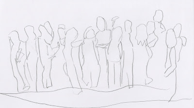
First drawing that I chose is of a figure sitting down and a figure standing. This drawing allowed me to experiment with drawing figures at the same scale but in different positions in space.
The last two drawings are of groups. I find these drawings appealing due to all the different positions the people are in. It adds character to the drawing. The abstractness of the drawing also allows the viewer to create their own perception of what the people may be doing and what they look like with detail.
Thursday, November 4, 2010
Luminaire Sketch Model and Inspiration
Side View of Model
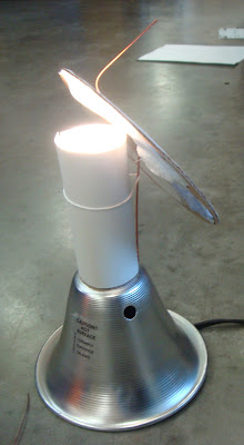
Light is projected through a toilet paper roll onto the rotatable circle template.
Front View of Model.
As you move the rotatable circle template, one can see each shade of light change throughout time.
This idea has helped me in forming another approach to this project. In becoming inspired and through research I have found inspiration in the following (shown below). My next approach will be experimenting with cardboard boxes of multiple sizes in making an interactive light box in which people have to go inside to experience changing of light. It is possible that a timer of some sort be used as well as a reflective material (mirror). My goal is for the viewer to learn about angles of sun throughout the year and the changes of value and color of light throughout the day, just as I have learned in my analysis of light project.
This is a picture of the Chicago O'Hare Airport underground terminal pass.
As a person rides the escalator sidewalk the lights around them change giving a unique interesting light phenomenon.
Byzantia by: Nevena Kovacevic
Moodwall By Urban Alliance
This is in a pedestrian tunnel in Amsterdam. It is to make the pedestrians feel more comforted and safe when walking in the tunnel.
Infinity Mirror look
http://www.instructables.com/id/LED-Infinity-Mirror-32-LEDs-Selectable-Patterns/
Wednesday, November 3, 2010
Evaluation of Journals
Throughout the semester, I have practiced my drawing skills in a daily journal sketchbook. For a few weeks, I focus on a specific object or drawing technique and practice them. So far, I have had the opportunity to draw leaves, twigs, bottles of water (showing light), and am now getting the privilege to draw self portraits. Below are three sketches from my sketchbook showing one drawing from each of the first three objects.
This is the very first drawing I drew in my journal sketchbook. The location of this drawing was in the studio at my cubical. It was sitting in the window seal and the light reflecting inside the window cast a light shadow below the object. The details in the curves and shape of the object are strong, yet I feel that shading of the object and value could be improved.
This drawing of a twig was drawn in class during an in class activity. The twig was one of my classmates and was sitting on a cubical desk. I believe the shading and value of this object was well developed, but think the casting shadow on the table below could be strengthened.
This is a drawing of an empty icecream cup filled with water. This was drawn at my apartment at my dining room table. The different values shown shows aesthetic quality, however, more details with the values and shadows could be improved and help the overall object.
After evaluating my individual journal sketchbook, I was asked to evaluate two of my classmates journals as well. Below is two drawings that I have found inspiration in and have learned from as well.
 | ||
| Picture Credit: Caitlyn Whisenant |
This is a drawing of a wood project my class had to design. Above is a drawing of the wood model Caitlyn made. I really find this drawing appealing because of the detail shown in the wood. One can see each little detail in every piece of wood. Also, the bottom piece of wood has a darker value to it which implies a shadow that the pieces of wood makes on it. I feel that by looking at this drawing I can improve the detail of my drawing and the shadows in them and encourages me to move away from my comfort zone and take a risk at drawing more.
This drawing is a twig that Beckie Yohn drew. I found this drawing appealing because of the shadow cast on the table the twig is sitting on. By drawing the shadow, the twig looks more dimensional. Also, the shadow has so much detail that one can gain more information about the twig from it. I think this is a strength of drawing and hope I can make my drawings show this amount of detail in shadow and dimensionality.
Subscribe to:
Comments (Atom)


